Portfolio

Smart Offer:
BB Seguros

How I simplified buying insurance in the Banco do Brasil app down to a single click.

Client BB Seguros · Banco do Brasil
Product Ourocap
Role UX Designer / UI Designer
Year 2025
Team Marketing, IT and Business
Method Design Sprint
View case
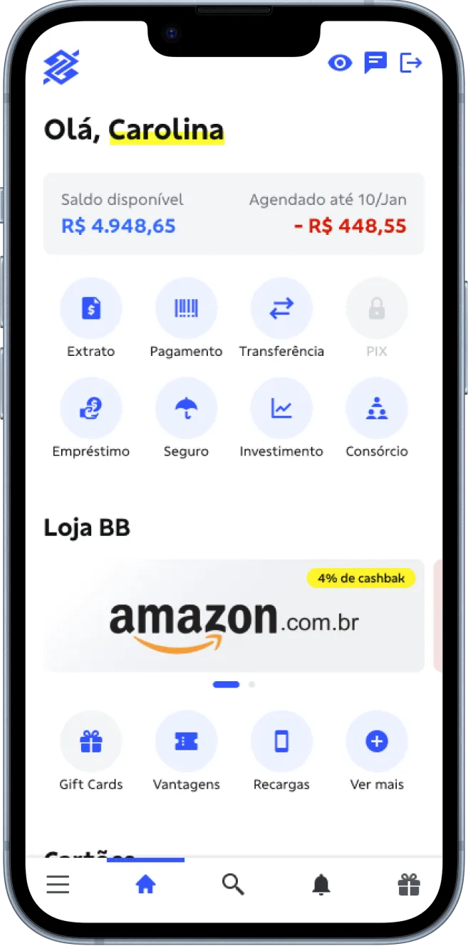
Banco do Brasil app home screen showing the offer

I reduced buying insurance in the Banco do Brasil app to a single click, with personalized offers and 45% views right at app entry.

(1) Challenge

Long purchase journeys led to drop-off. The problem wasn't the offer, but the timing and the effort required from the customer.

(2) My role

I led the UX work in a Marketing, IT and Business team, from the Design Sprint to the high-fidelity prototype.

(3) Solution

One Click concept: personalized, pre-priced offers at app entry that only ask for final confirmation.

(4) Result

45% of users viewed the offer at app entry, and 20% of those reached moved on to buy Ourocap.

Challenge and process

In large institutions, long purchase journeys tend to end in drop-off. At Banco do Brasil, the problem wasn't the offer, but when it appeared and the effort it demanded. The goal: identify the customer's profile and offer the right product, at the right moment, with as few clicks as possible, reducing reliance on physical branches and increasing digital conversion.

I used the Design Sprint as an engine for innovation. In a structured immersion, we broke down the silos between Marketing, IT and Business and validated viable solutions with existing resources: technically feasible and commercially strong.

(1)
Personas

Who the customer was for each offer.

(2)
CSD Matrix

Certainties, Assumptions and Doubts, to get rid of guesswork.

(3)
Collective ideation

Marketing, IT and Business working together on direct sales, upsell/cross-sell and retention.

(4)
High-fidelity prototype

Validating the journeys with viable solutions.

Design Sprint with Marketing, IT and Business. Click to enlarge.

The solution

The “Smart” solution dynamically adapts the interface to each product's strategy. The complexity stays invisible to the customer: mind maps and decision flows allowed the system to anticipate the customer's needs and present pre-priced, personalized offers that only require final confirmation.

The result is a product-agnostic strategy, consolidated into three main journeys validated with high-fidelity prototypes. By simplifying the experience to One Click, we set a new usability standard for BB Seguros: in financial services, simplicity is the greatest competitive advantage.

Smart Solutions mind map. Click to enlarge.

High-fidelity prototype, from offer to completed purchase. Click to enlarge.

Result

Strong performance across the conversion funnel, validating the strategy of showing the offer at app entry.

45% offer views, with the bottom sheet as the offer's entry point.
20% of users reached moved on to buy Ourocap.

What made the difference

Showing it at app entry Increased the offer's reach
Bottom sheet Visibility with low intrusion
Direct messaging on the card Quick understanding of the product
Simplified flow Fewer steps to purchase
One Click model Less effort for the user

What I learned

Taking part in Banco do Brasil's Design Sprint was an intensive lesson in aligning complex business goals with real user needs. Every decision became evidence-based, with no guesswork and a focus on what creates value.

The outcome was a high-fidelity prototype focused on conversion. By reducing the journey to One Click, we didn't just deliver screens, but a tool optimized for real business results and a frictionless experience.